Researching borrowed colour in my drawing practice
I got into the studio early today to gather my thoughts and do some research.
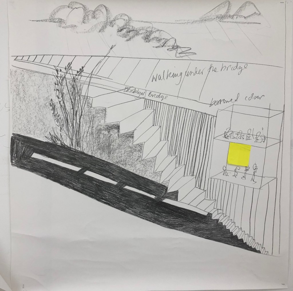
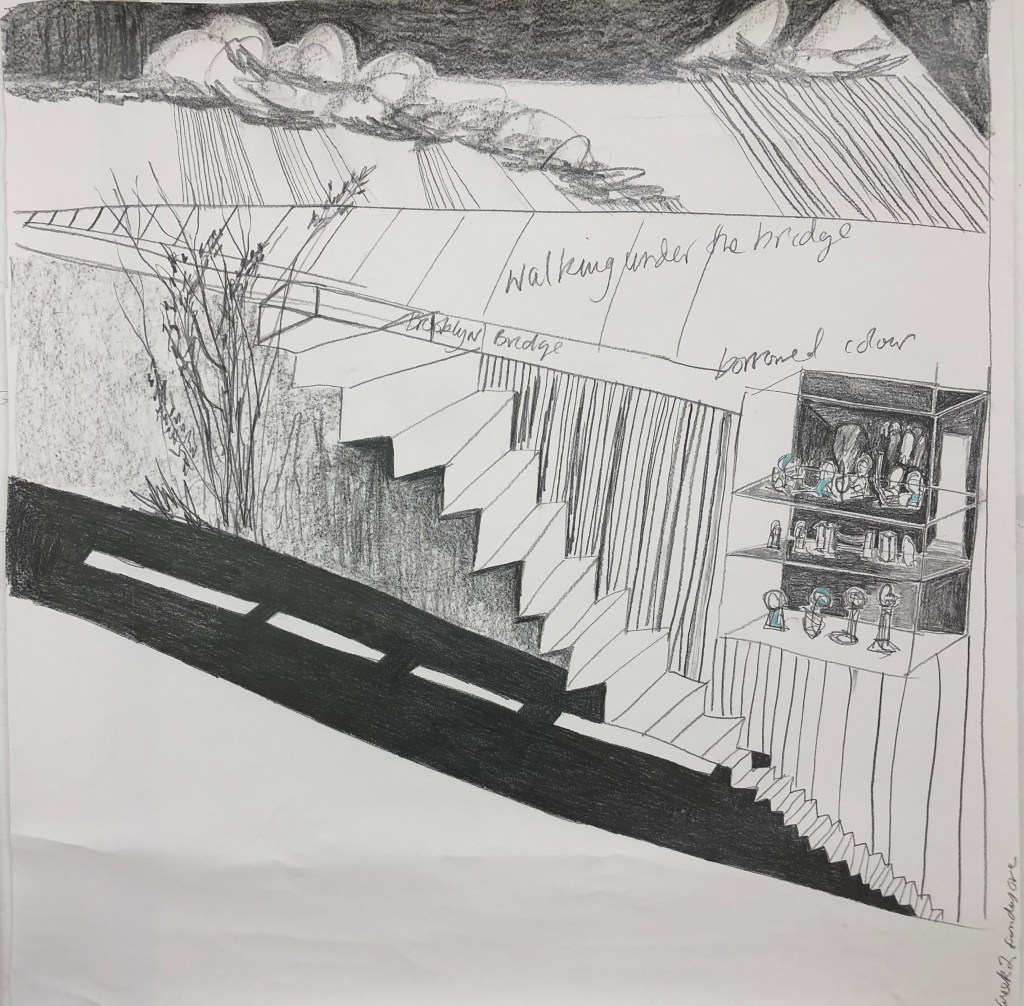
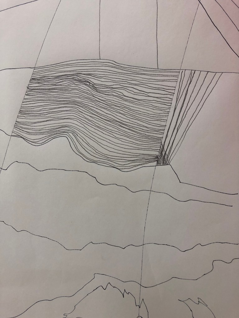
I spent some time developing the drawing I had started on the first week of the studio move-in. I had used a connection between the space, my dream and the journey to New York earlier in the year to make a piece of work to help me find my sense of place within this new environment. A mixture of the unfolding landscape outside the space and the unfolding story of my postgraduate study. The steps, the road, the doorway and the ladder across the landscape all creating a pathway for the transformation between states. During this making this piece over a few days I had also looked back at some works by Helen Chadwick, who played a pivotal role in my early work. Her work was about her sense of self in relation to the architecture around her/us. How we act and react to the built environment was something I used as a young artist and I was thinking about this movement through this space in the drawing albeit with a lack of the person within this work, the journey being cerebral.
I came in early on the 3rd of October to work into this piece again and add some details. The idea of borrowed colour has been running around my mind quite a lot recently. It’s the idea of not mixing or creating colour but using what is available. It is a device that Helen Chadwick used in her Wreaths to Pleasure (Chadwick, 1992-93), using found colours such as the vibrant purple of a household cleaner, swarfega and gels or the rich colours of flowers. See fig 1 below.

Fig 1 Chadwick, H, (1992-93) Wreath to Pleasure no. 5 photographic object [Available online]
In Chadwick’s artwork, you can see the colours used are of the domestic materials as they come from the container. In my own work, in a similar way to Chadwick, seen below, I have just used some found blue. In the dream I used through memory to work on this piece, the small scale sculptures within the cabinet were the colours of regalia found in common tourist trinkets. I had dreamt of them being of London and somehow the colours I recall are of those kind of vintage colourised film of London from the post war era. I found these colours in an abandoned palette and have included below.
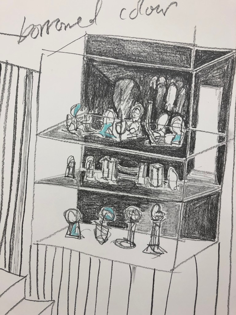
showing cabinet of tourist trinkets with a found blue colour
Here are a few found colours and borrowed colours I have found from the past few days.
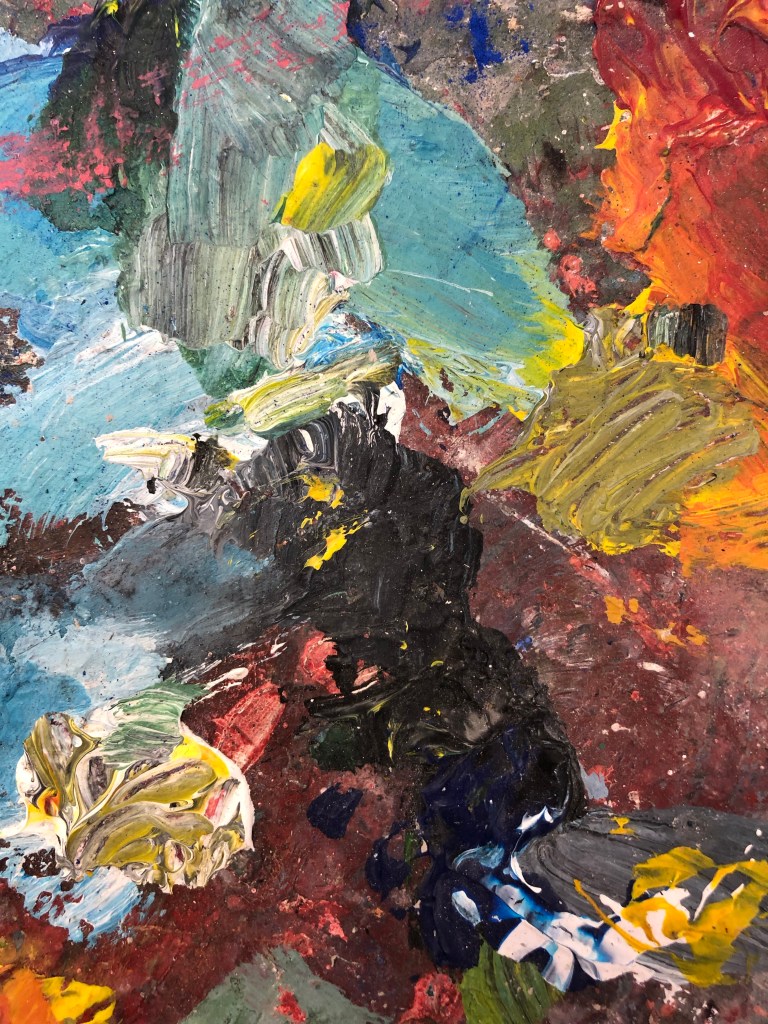
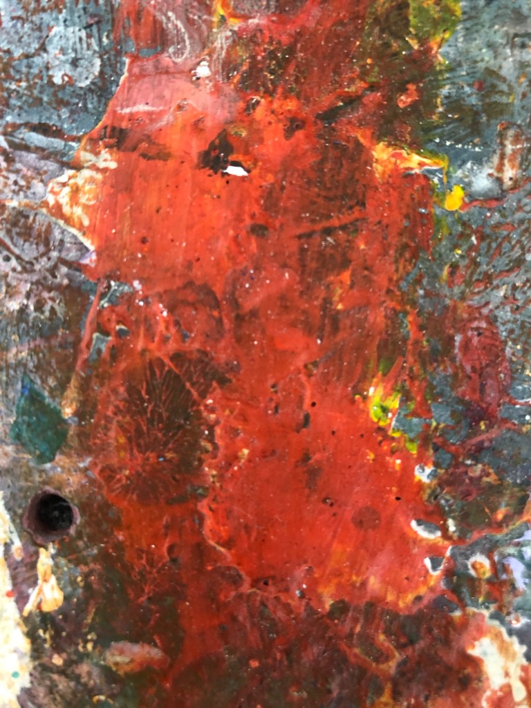
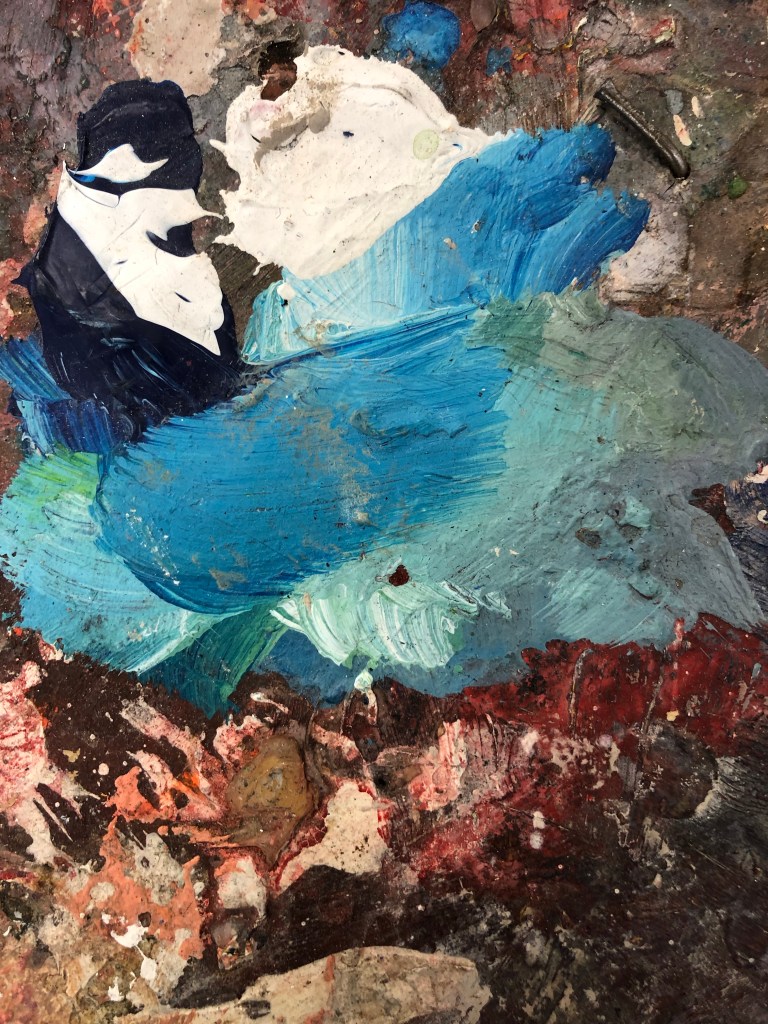
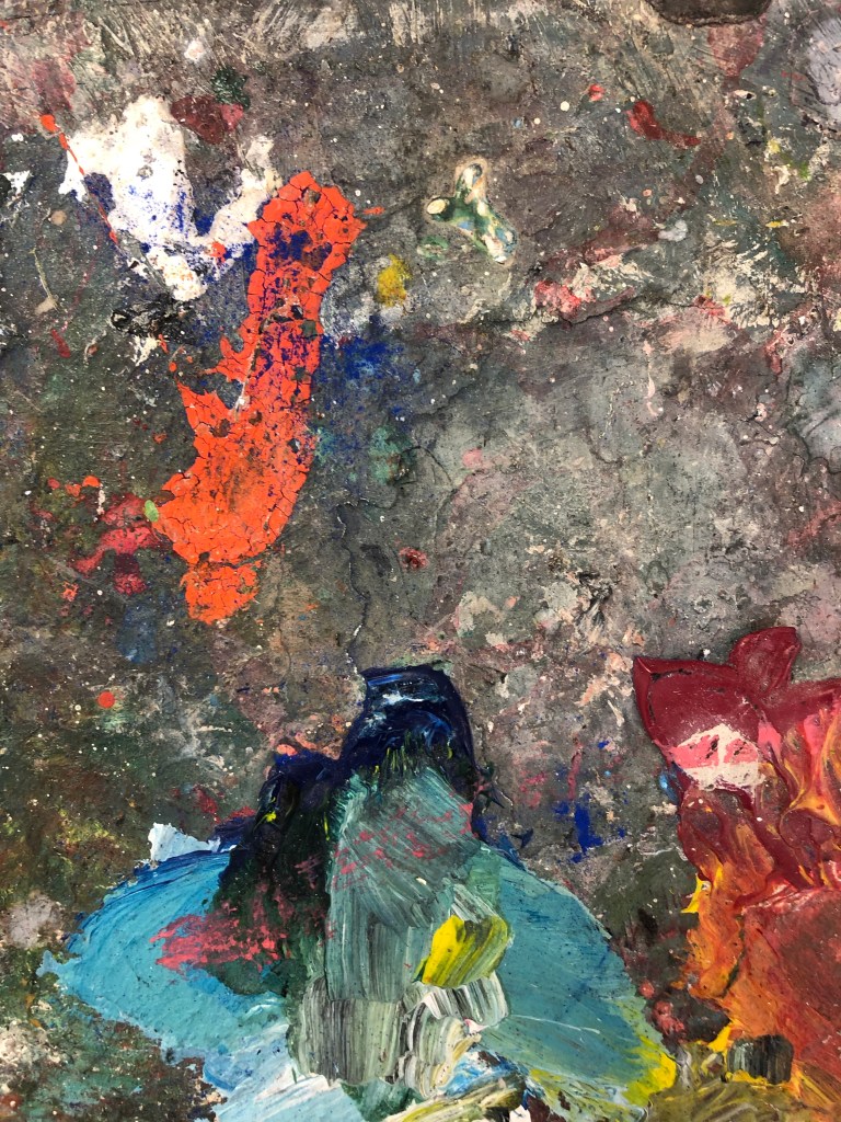
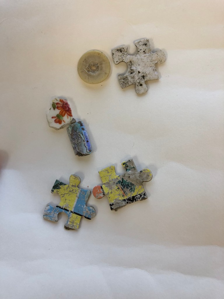
finds from my walk to studio Hitchin market
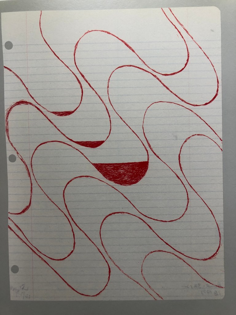
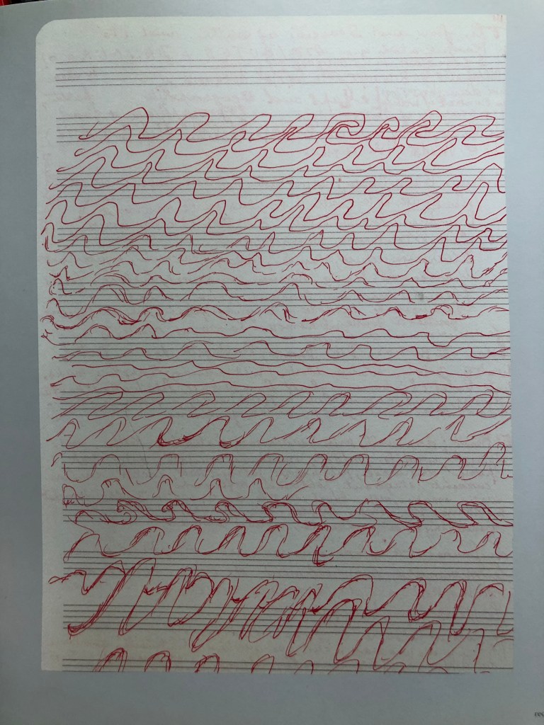
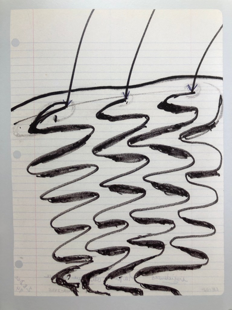
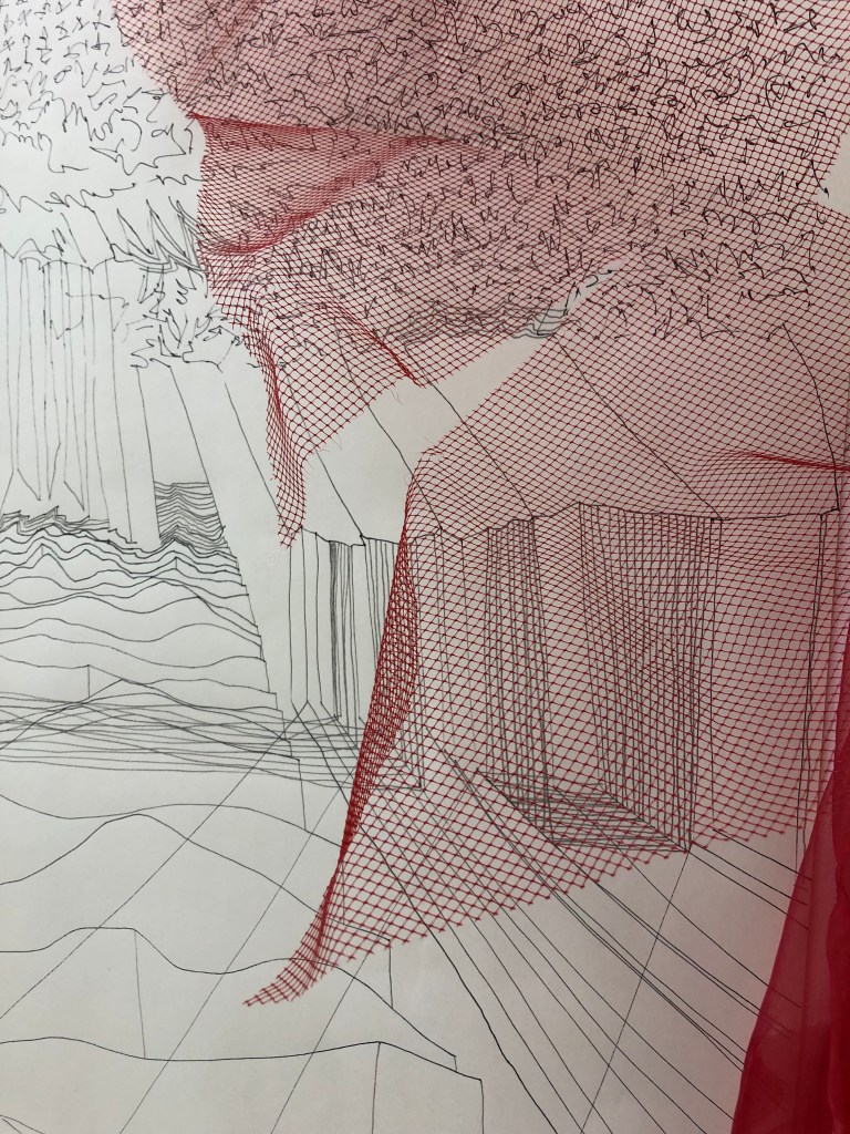
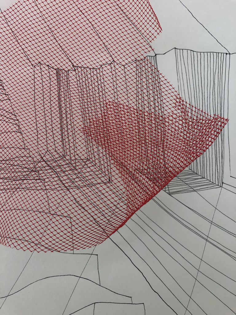
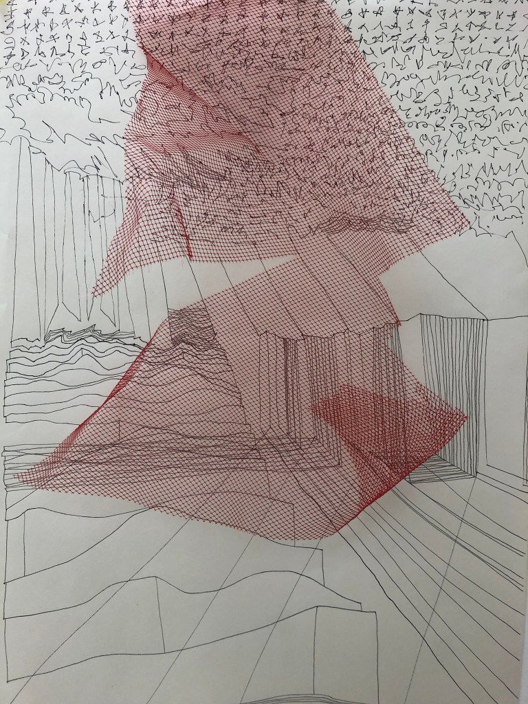
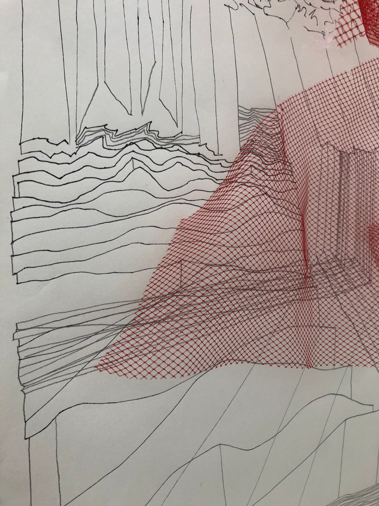
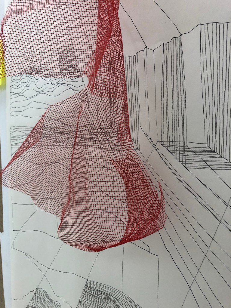
I took this idea of borrowed colour into the third dimension and offered up the found objects I have previously been using to look at the third dimension of my drawing. In the studio I placed the red net piece edges over the vertical drawing I have been developing in my space to see how the found red worked over the the drawings. I have been looking at the insomnia drawings of Louise Bourgeois in detail and her use of red in her drawings straight out of the pen, usually biro is so strong.
I am very interested in how to bring the drawn line into the third dimension and these experiments are really me trying to do this through the photograph. I further researched colour in Bourgeois work and discovered her later fabric pieces using only colour from found and bought fabrics. Her colour palette when its there is very reduced and in the insomnia works is just limited to red, blue, yellow, black and green. These are the standard colours from stationary type pens she would use what was to hand in the middle of the night. These were never supposed to be viewed as serious pieces of art yet give a great insight into her world. As I use recall, memory and indeed have used these colours and materials throughout my life, I felt a real pull to this work.
Reflecting on this work will continue to develop how colour theory is at play here and look at my use of borrowed colour from the found objects I had brought to the studio. Looking at how artists such as Chadwick and Bourgeois, through the materials they used in their pieces highlighted above have used colour in this way is an avenue of research for me. In my research I have looked at Bourgeois use of colour in the fabric pieces she made later in her career. I want to look conceptually at how to get colour into the work, but this is a long game and will develop naturally.
Fig 1 Chadwick, H. (1992-93) Wreath to Pleasure no. 5 – photographic object [Available online] http://www.artnet.com/WebServices/images/ll897480llgCTjR3CfDrCWvaHBOAD/helen-chadwick-wreath-to-pleasure-no-5.jpg Accessed 3/11/2019
